Tuesday, June 29, 2010

EXCELLENT TRIPOD = EXCELLENT PHOTOGRAPHY!

If you are in the market for a tripod, I do not know of a better time to buy one then right now! Why? You will find out in a moment, but first when should you use a tripod?

You should use a tripod when you are shooting in low-light, when you are looking to record exacting sharpness, when you are shooting with really long lenses, when you are shooting a family portrait, when you are shooting a self-portrait, when you are shooting a waterfall at a 1/4 second, when you are shooting a city scene at night, when you are shooting with Graduated ND filters.
When you are doing close-up photography, when you want to keep your horizon lines straight, when you need to lock up your mirror, when you are zooming during long exposures, when you get down low to foreground interest and you want a great depth of field, when you shoot in a meadow of flowers and you are isolating a single flower, when you are shooting with rear-curtain sync and your flash.
When you are shooting star trails at night, when you shoot the moon, when you shoot a sunset at the beach, when you want to shoot a panorama.


When you...Finally, when shooting any subject with your tripod, make it a point to use either the camera's self timer or a cable release to trip the shutter release.

So, why is now the best time to buy a tripod? Because the BEST tripod that I personally have been waiting on for the past 12-months has finally come on the market, and at a price that is so darn affordable, you'll be tempted to buy two of them! (But don't! This is a tripod, not a plasma TV!)

Our great friends at Adorama have in stock ready for shipment, the all new Flashpoint Carbon Fiber Tripods with the Adorama Flip Lock designed leg release system which uses a patented process for making the plastic from different polymers at an extremely high temperature to create a lock that will not fail. These non-slip flip locks will keep the legs locked into position. Set up and closing time becomes fast and without effort. A victory for sure for those of us who have loathed the "twist/lock legs"!

The Flashpoint Carbon Fiber material is an all new material and is considered a major break through by combining traditional carbon fiber with latest carbon fiber tube technique-bullet proof fiber complex (patented). The anti-resonance effect is increased by 60% over the old technology. The major benefit to this carbon fiber over all others is greater rigidity, which will prevent tube rupture.

Each leg can be set at multiple angles and the center column can be separated into a low column for ground level use.

They all include a bubble level and have a rubber pads on the bottom of the legs with retractable ground spikes for use in rugged terrain. Leg friction can be adjusted to match the needs of the photographer. And in case you didn't know, Carbon fiber is more than 40% lighter than the same item made in aluminum. You will indeed be feeling a "bit light in your loafers" as you walk those mountain trails with one of these tripods! And now check out the specs and of course you can order by clicking HERE!

Tuesday, June 22, 2010

ITS ALL ABOUT RELATIONSHIPS!

Let me ask you, "What is the most important element in a group shot? "

Sure you want everyone to look their best, but the essential ingredient is more than
smiles, eyes looking at the lens, and natural poses.

What makes or breaks the group shot are the relationships portrayed - the subtext, the connections. These nuances require collaboration. The subjects must relax, remove the masks, and be themselves.

As a children and family portrait photographer, I often photograph groups and I always do my homework. I know the environment and the lighting beforehand so that I can go ahead and work with the group and not be tinkering with my camera and the settings.

I also work fast. The nine-month-old in this group photo was cooperating, but I knew
that would change. To accomplish the photo, I had two assistants standing three feet high on step stools and holding a large diffusing screen (a 42-inch translucent zip disc) to cut down the harsh 5:00 PM (EST) September sun. Indian summer sunlight casts a beatific glow, but it is a challenge to work with.

Typically, I shoot on manual exposure mode and select the ISO required to shoot with the aperture/shutter combination I want. For this session, I wanted to shoot with an aperture of f/8 or f/11 (to ensure sharp focus on more than one focal plane) and a shutter of 1/100 since I was handholding my Canon 5D with a 24-105 mm lens (the rule of thumb to avoid camera shake is 1/focal length of the lens). I settled on an ISO of 1000.

To fine tune the exposure, I took an incident reading, placing my handheld under an
assistantʼs chin, pointing to the lens (or where it will be) to get an exposure comparison. I then fired off a few test shots (my assistant as a model) and used the cameraʼs histogram to fine tune my exposure. I was looking for good facial values; the majority of pixels to fall in the middle of the histogram.

This particular client prefers black and white images, but I will shoot in RAW and convert later using NIK Silver Effex or the Adobe Photoshop b/w adjustment layer. Even though my client wants black and white, I would rather have color files in case she also wants color photos.

With group shots, I usually do not use a tripod because I move around so much. I often lie on the grass which is a great way to relax my clients.

Depending upon the age of the children, I will bring one or two, or sometimes three
assistants. With babies, I know I have a very brief window of opportunity to nail the
image. So the more hands the better.

I work with fill flash and sometimes reflectors. I use a "Pro -T" flash bracket and a
Canon Speedlite 580 EX II, with a Sto-Fen for a diffuser. Indoors I use the Gary Fong Cloud.

If the group is stationary, I have more ability to use the reflectors. But my style is to
encourage a certain degree of movement, so reflectors are not always practical. Some times diffusers are the rule, as the bright sun needs to be filtered to block the harsh rays.

I use a "jill-e" black leather camera bag (some people have told me it looks like a Marc Jacobs bag). In addition to my camera, lens, flash, and bracket, I always carry some anti frizz hair gel, mosquito spray, a brush, and some bubbles. In my car trunk I have a step stool and a tripod.

If you are interested in photographing children and families, and are thinking about becoming a child photographer, then join me for a class. Many photographers have begun their careers by photographing their own children. Let me help you learn how to put it all together.

I also teach "All About Color" and "Painting Photos". Feel free to send me a note:
cheryl@cherylmachatdorskind.com

All My Best,
Cheryl Machat Dorskind
Instructor/PPSOP.com

Saturday, June 19, 2010

IDEA'S ARE LIMITED ONLY BY OUR IMAGINATION!

The great folks at Bogen do make a host of fantastic tripods but they also make a host of attachments that allow the photographer to put a camera just about anywhere he/she can imagine. One of my favorite gadgets of theirs is called the Avenger Pump Suction Cup.

With the aid of the Avenger 'Super' Suction Cup, (and boy do I ever mean 'Super Suction') I was able to mount my camera and fish eye lens on the hood of my friend Phillipe's car intent on firing off a number of exposures as we drove through several long tunnels. And to add a bit of 'horror' to this motion-filled idea, Phillipe and I donned masks, (they were having a Halloween close-out sale at the local variety store). I'm the passenger and Phillipe is driving.

Of course I wanted to record the sense of motion that one experiences when driving through tunnels, which meant I would need a 'slow' shutter speed of at least 1/2 if not a full second. And in order to determine what aperture I would need to use at these speeds I needed to take a meter reading under a lighting condition that would be similar to the light we would find inside the tunnel. Getting that meter reading actually proved rather easy, as I suggested that we first drive through the tunnel, without the camera mounted on the car, but rather with the sunroof open, which then allowed me to shoot down onto the hood of the car and take my meter reading. Once we were inside the tunnel I stood up, and with my 17-55mm lens and camera set to 100 ISO, I simply pointed it at the hood of the car in Aperture Priority and found that when I chose f/8 I had a correct exposure indication of 1/2 second and of course at f/11 the correct exposure was now indicating1 second.

After this first trip through the tunnel, we exited and pulled off to the side of the road. With the bright interior dome light on inside the car, I took another reading of Phillpe's face and discovered that also at f/11, I could get a correct exposure at one second. I had the 'numbers' and now we were all set. I chose to leave the camera in Aperture Priority Mode, rather than manual, knowing that if I set the aperture to f/11 the camera would record a correct exposure somewhere in the neighborhood of one second, depending on the varying degrees of brightness as we drove through the tunnel. So, with the camera in Aperture Priority Mode, the fish-eye lens set to f/11 and pointed at 'us', and with my remote triggering device mounted to the camera, we were ready to begin our journey through several long tunnels, but NOT before donning our ghoulish masks. I wanted this to be a 'ghoulish dream' kind of photo. As we drove through the tunnels, I would simply fire the camera from inside the car with the remote sending unit. After making several trips through the tunnels, we pulled over and I began a quick review of the images and it was clear that I had my shot.

I wanted to add that Phillipe's car is actually light blue and once inside the tunnel, it recorded an odd bronze cast that no amount of PhotoShop could repair. But it was also while trying to recover the light blue color in PhotoShop, that I came upon this 'wild' purple color and the more I viewed it the more I liked it so a purple car it is! This color was the result of 'playing' with both the Color Balance and Hue/Satruation controls in PhotoShop.

Here is the set-up with the camera and fish-eye lens suction cupped to the hood of Phillipe's car. Honestly, it was my experience that this Bogen Suction Cup made a bond that was as strong as steel! You will also need a Bogen mounting plate for the camera, which in turn gets attached to the suction cup.

All My Best,
Bryan F Peterson
Founder/PPSOP.com

Wednesday, June 16, 2010

In the Darkroom with the Rule of Thirds


Many times photographers will ask a simple question "How do I check my photographs if they conform to the Rule of Thirds?". As you may know, the Rule of Thirds is the most basic, yet powerful fundamental aspect of composition. In a nutshell, your images should conform to the Rule of Thirds so they are pleasing not only to the eye but to the mind. The basic principle behind the Rule of Thirds is to imagine breaking an image down into thirds (both horizontally and vertically) so that you have 9 parts, sort of like a tic-tac-toe board.

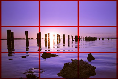
One of the most common mistakes many photographers make when photographing landscapes or sunsets, is that they place the horizon smack in the middle of the frame. What does this say to the viewer? It's kind of like watching a football game, where the game ends in a tie. No one that paid all that money to sit in the stands wants to see a tie, we all want to see a win. That is like what you are saying when you place your horizon in the middle of the frame, almost as if you couldn't decide what was more important, so you threw your hands up and called the game.

When I lined composed this beautiful sunset, I hadn't realized my mistake of placing the horizon right in the middle of the frame. When you look at this composition, I give the viewer an empty feeling, for it feels as if I couldn't decided what was more important in the composition - the sky or the water.


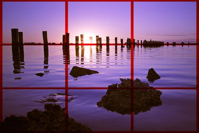
Seeing the error of my way, I adjusted my camera on my tripod, and by using the Rule of Thirds, I decided that the water was what I wanted to be the main subject in my composition, so I placed the horizon along the top horizontal line in my grid. This resulted in a photo that is much more appealing.

"So ok, now that we know a little about the Rule of Thirds, what about those photographs I have already shot?!?!"

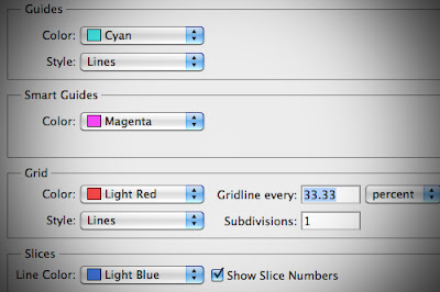
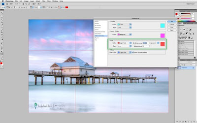
I have an easy way to check your work using a little known preference in Photoshop using the "Grid". When you set it up, from now on, any image you open you can quickly and easily overlay a grid that when you set it up correctly will instantly show you the Rule of Thirds that you can even assign a key shortcut to toggle it on and off at will. To get it set up, first we need to do the following steps: 1 - Go to: PREFERENCES > GUIDES, GRIDS & SLICES...
2 - In the dialog box, look at the box where it says GRID
3 - First, select a bright color so you can see the grid such as LIGHT RED
4 - For the STYLE, select LINES
5 - Here is the important part... In the GRIDLINE EVERY type in 33.33 and change the drop-down to PERCENT
6 - For SUBDIVISIONS type in 1
7 - Click OK to save your new preferences
----------

Click Here To View How To Set The Preferences In Photoshop (http://www.robertlafollette.com/blog/public/gridlines.html)

----------
To see your new preferences in action and to overlay your Rule of Thirds grid, simply go to VIEW > SHOW > GRID and voila! An instant Rule of Thirds Grid! You can also assign a shortcut to access this very useful new trick by going to EDIT > KEYBOARD SHORTCUTS... that with a simple keystroke you can turn off the Rule of Thirds grid very quickly and conveniently. It's that simple!

Want to learn more in-depth about the Rule of Thirds and how to take your images to the next level? Then join me for the most comprehensive course taught on the internet about composition today! Click here to learn more about "Must Know" Fundamentals of Composition

All My Best,
Robert La Follette
Instructor of PPSOP.com

Saturday, June 12, 2010

Every photograph is a 'lie', yet within that 'lie' is a mountain of truth, a truth that is perhaps best defined as "The Sizzle!"

As you may recall, a few days ago, I raised the question of 'integrity' when it comes to the dramatic alteration of one's photograph via Photoshop. In case you missed it, I have uploaded both of the photographs again and the image on top is the original while the image below was altered via Photoshop; namely I replaced the foreground grasses and distant road with another photograph that included a foreground of a sandy beach.
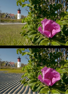
I received more than 450 emails to my question, "Do we have an obligation to tell the viewer when a photograph has been dramatically altered in Photo-Shop?" and the votes are now in!

Before sharing with you the results of this unscientific survey, many of you made it clear that there is only one area in photography that is deserving of the "death penalty" if one is found to have dramatically altered an image and that is the area of Photo-Journalism/Documentary Photography. But, and to my amazement, 41% of you felt that when a photographer dramatically alters an image he or she is NOT obligated to tell anyone, unless asked. And a few of you even stated, that if asked, you would simply say, "That's none of your business!" There were a variety of reasons why most felt they had no obligation to tell anyone if the image was dramatically altered, but suffice it to say, all of the reasons could be easily quantified as "artistic license".

Personally, I have NO problem with any image that has been dramatically altered, as long as it is 'believable' OR so obviously altered that it's not even a question e.g. fantasy, dream-like photographs. I don't mind the 'lie' that is created from a dramatically altered image, since I have felt for years that every photograph is a 'lie' anyway, but my problem with the dramatically altered 'lie' is that it can lead one to believe that a given landscape or cityscape really does "look like that" when, as it turns out, there is no such place on earth.

Several years ago, I came upon a really beautiful image of a street scene in Paris. It was an image I saw on a photographers website. In the foreground was the street sign, Rue Ravoli. A few weeks later I was in Paris and I tracked down this 'street' and as you might have guessed, the street I vividly recalled in the photograph was nothing like the street I was standing on. There were only two buildings that I recognized and everything else on that street was an obvious composite of other shops and cafes that were probably taken in other parts of Paris. On a strictly personal level, I tipped my hat to the photographer who obviously possessed some terrific Photo-Shop skills. It was clearly one of the best Photo-Shop composites I had ever seen. But, on the other hand, I was disappointed that such a place did not exist, if only because I wanted to see what I might be able to do, photographically, on that same street.

If you know me at all, I am 'old school'; I am a big fan of "getting it right in camera". For the longest time I have taken great pride in meeting the personal challenge of creating unique images and since the advent of Photoshop I have at times felt quite smug, knowing that I got 'that' image without the use of Photoshop. I love it when someone asks, "Did you do 'that' in Photoshop?" and with the biggest smile across my face, I say, honestly and often emphatically, "Nope, it was all done in camera!"
Since last week however, I now find myself thinking about my "get it done in camera" attitude and I must confess, I have now come under my own suspicion!

How many times have I 'dramatically altered' a scene before actually photographing it? In 35 years of shooting that answer would be at least a few dozen times, I am sure! One such scene that I recall vividly stands out more than any other and ironically it also involves a city street, a city street that was dramatically altered, all for the sake of a photograph. I was hired by an advertising agency to photograph a European street scene, complete with a Bakery, Café and a Newsstand. I scouted various locations and hired set-builders, stylists and of course 'European' models and several weeks later the shot of the European street was taken in the early morning hours in downtown Portland, Oregon!

The shoot itself lasted about two hours and by that afternoon, all that was left of the European street scene were 11 rolls of 36-exposure slide film. The 'lie' had been successfully recorded and now that 'lie' would continue as the State of Oregon Tourism Dept. began running two-page spread advertisements in many national magazines, promoting Portland as a European city alternative.

This is of course my most extreme example of being party to a dramatically altered image. Clearly, most shooters don't think twice about dramatically altering the scene before them, as long as any changes are done before they take the picture. Why is that approach any less 'dishonest' than the dramatically altered images done by others with the aid of Photoshop? As for me, I had been struggling with that question all week.
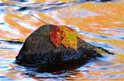
What if I make only minor alterations to a scene before I take the picture? Am I still 'guilty' of altering an image if I ADD or SUBTRACT just a few things? The image above has been altered. How has it been altered? I placed the leaf you see on that rock there, in full view of several of my students. Does it look 'natural', believable? Before answering that there is another part of this story that you need to hear. Within ten minutes of placing that leaf on this rock, several other photographers who were not part of my workshop had arrived in the same area, and myself and several of my students overheard the following remark made by one of the photographers, "Wow, check out the leaf on the rock!" And without hesitation both of these photographers set up their cameras and tripods and fired away. As far as they were concerned, the leaf that on that rock was natural!

The debate over 'natural' or 'altered' images is really OLD NEWS! In fact it can be argued that every lens choice, every point of view, every 'creative exposure', every filter, to name a few from the list, are all guilty of 'altering' an image. As far as I am concerned, you can even add the mere act of framing the image in-camera as another example of altering an image! Let's look at several examples and see if you don't agree.
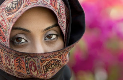
The image you see here has been altered dramatically, yet I will add that it was altered 100% in-camera and without the aid of Photoshop, NOT that that should matter! It was altered 100% by LENS CHOICE, POINT OF VIEW and a LARGE LENS OPENING. We can all agree that the woman you see here is probably of Middle-Eastern descent, but after that, it's anybody's guess what the rest of the story might be.

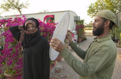
One thing is sure. Without benefit of the photograph below, you would have never guessed that this image was made in a nursery next to a trailer, and with the aid of an assistant who is reflecting some warm light onto her face. In addition, the model did not have the right pins to hold her headscarf in place so she had to use one of her hands to hold the headscarf in place while I took the shot! With the telephoto lens and a large aperture, I was able to render a shallow depth of field AND with the right point of view I was also able to avoid recording any part of the trailer in the background. When we consider the subject and the surroundings, there is no question that I have dramatically altered the scene to get to my end result.
One more example and I will then turn this debate over to you. In the photograph below we see a woman in a red sweater, doing her laundry, along with several other women in the background, walking in the shadows. Once again, it's anybody's guess what the rest of the story might be, but rest assured, the image you are looking at has also been 'dramatically altered'. It is an image that was cropped, in camera, by the use of a long telephoto lens and further 'altered' by manipulating a deliberate in-camera under-exposure so the shadows would go black. And again, not that it matters, but this image was also done in-camera.
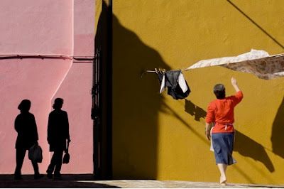
As you now have the benefit of the 'bigger' picture below, it becomes readily apparent that the above image was indeed altered. Again, with my telephoto lens, I was able to cut through the surrounding 'clutter' and arrive at what I determined to be the much cleaner composition in the photograph above. So, again, by the mere act of LENS CHOICE, I have created a compelling composition of a very small part of the larger scene before me. Like it or not, I am once again, guilty of altering an image.

Every photograph is a 'lie', yet within that 'lie' is a mountain of truth, a truth that is perhaps best defined as a "The Sizzle!"

Years ago, like many photographers who are just starting out, I needed to have a 'real' job to support myself initially. One of those jobs was selling insulation and storm windows to homeowners and I remember the sales manager's advice to all of us in our weekly sales meetings-"Sell the sizzle not the steak!" In other words, appeal to the customer's emotions (the"sizzle") and when you sell the sizzle, most customers will be quick to buy the steak!

When I think about memorable photographs, images that truly do leave a lasting impression, it's fair to say they all have a common thread. They are images that "sizzle", they are images that excite or ignite the emotions of the viewer.

Your camera's viewfinder, combined with a given lens choice, point of view and an understanding of light, exposure and composition fundamentals, is able to record an image of great emotion, regardless of the overall truth that was surrounding the image.

I can think of countless images I have taken that suggested 'peace', 'joy', 'elation', 'sensuality' or 'sorrow'. Yet, if you saw the 'big picture', your reaction might be quite different. Prior to the digital age we now live in, all photographs were made with film and for those of us who shot color slide film exclusively, myself included, a cloud of suspicion rarely hung over us. (Make note of that word 'suspicion'.)
Since the digital age, and with greater frequency, the emails I receive from readers raise the question, "Did you do that in Photoshop?" It is a fair question, and for the most part, the answer is no, but the fact remains, a cloud of suspicion is a constant in my photographic life today as it is or many other shooters. However, just this past week, I have concluded, that it has been my attitude towards "dramatically altering an image in Photoshop" that is behind this cloud of suspicion because I, like so many others have been preaching for way too long that it is somehow far more noble and far more an indicator of one's creativity if you can get the shot in camera! Yet, as I have just shared with you, I now realize that I have been altering images, sometimes dramatically, in camera for years, but what is the difference between doing it in camera or in Photoshop? Seriously, what is the difference!? I am not only 'guilty' of altering images for years, but also equally 'guilty' of arrogance!

Going forward, I will continue to use the same barometer I have used for years when looking at the work of other photographers; "Does this image make me feel, does it excite or ignite my emotions, does the image sizzle? Whether or not its 'real' or believable is really NOT important, (crime scene photographs, passport and drivers license photographs being the exception!)

And if and when I start dramatically altering images with the aid of Photoshop, I will be the first to answer, "Yes I did!" should anyone ask if I did that in Photoshop. I finally understand that for many shooters, Photoshop is their main tool for creating much of their compelling imagery. And if it's Photoshop that accounts for much of your "sizzling" work I'll still gladly be buying your steak!

To be clear I am a big believer in getting most if not all of my 'dramatic alterations' done in-camera; moving objects, adding objects, subtracting objects, creating blur, adding sharpness, seeking out appropriate backgrounds, manipulating exposure, or the occasional use of my flash to create sunlight and of course focusing on the final arrangement, (lens choice and point of view), which will result in the most effective composition. My reason is a simple one: doing my dramatic alterations in-camera is simply quicker than the hour or so I might need to do the same thing in Photo-Shop.

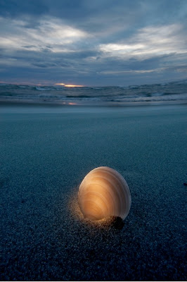
And finally in closing, I wanted to share with you another example where, truth be told, I have dramatically altered the image. My first dramatic alteration to this scene was adding a seashell, on its side no less, to an otherwise empty oasis of sand. My second dramatic alteration was adding light where NO light ever existed, thanks in large part to a small flashlight. My third and somewhat less dramatic alteration was setting my White Balance to Incandescent/Tungsten. This made the overall scene blue. My fourth and even less of a dramatic alteration was the use of a full frame fish-eye lens. Dramatically altered? You bet, but hey, at least I didn't use Photo-Shop-LOL!
Yes, let me know your thoughts if you feel compelled to share them in the comments below!

Thursday, June 3, 2010

A Photographic Challenge

On a recent workshop in Cape Cod, my students and I had just parked our cars at a beach wayside parking lot and excitement filled the air! All of us would soon be facing one of several challenges that this weekend workshop presented.

When we think of a lighthouse, images of the lone sentinel are often associated with bluffs, cliffs or beach or a rocky out-cropping, often surrounded by pounding ocean surf.

Well, as you can clearly see in the first photograph, this particular lighthouse was nowhere near any beach or pounding surf. In fact, I remember commenting to myself upon seeing this particular lighthouse "Whose idea was it to build a lighthouse in the woods?"

Most of the students walked ahead of me, proceeding across the street and up the small trail to the lighthouse. I and one other student stayed behind, as I felt the ONLY real shot worth taking here would be from the grassy area, where you can see a lone tea cup rose bush-(note the area that I have boxed).

Combining my Nikkor 12-24mm lens with the Canon 500D close-up filter, I was able to move in really close to a single rose bloom and frame up the scene you see here.

My initial reaction to this particular composition was fairly positive, BUT try as I might, I could not find a point of view that would allow me to 'lose' the roadway that is visible in the background. I did choose to shoot at a wide-open aperture, but even at wide open, (f/4) I was still unable to blur out the "unsightly" road in the background.

I did play around a bit with the Clone Tool in PS but that did nothing more than reveal a composition that now looked like I was trying to hide something. What's a photographer to do at a time like this?

At that moment I was struck with an idea as I recalled taking a number of beach landscapes the previous afternoon at a different location. You can see one of those beach landscapes here.

This particular image was also shot with my 12-24mm but at an aperture of f/16 and not surprising, unlike the wide-angle shot of the tea rose above, this image is super sharp, from front to back due to the use of the smaller aperture of f/16.

It was then that I got the idea! What if I were to combine the beachscape image with that of the lighthouse and tea rose? I would of course need to 'blur' the beachscape image so it would 'match' the natural blur of the lighthouse/tea rose image and once that was done, (using Gaussian Blur Tool in PhotoShop) I could then combine them and with the aid of a layer mask, "paint" this blurry beachscape into the lighthouse/tea rose scene and voila-that's exactly what I did!

Here is that image for all to see (If you don't know a thing about LAYERS, get signed up for Jon Canfeld's class-NOW!)

Assuming you have the knowledge on how to do a layer mask and assuming this was your shot, do you feel your viewing audience has the right to know that this image is a composite OR do you feel that it's nobody's business and unless someone asks, no one needs to know? If you have time comment here and let's get the discussion going!

Saturday, March 27, 2010

Lensbaby

Spring has arrived! Temperatures here in Maine have been amazingly warm, such a wonderful and unexpected thing, as March is typically a winter month here. More seasonable weather is expected this week (i.e. cold!!), but I managed to shoot some Snow Drops and Crocuses while it was warm last week. Because I didn't get my hands on the Lensbaby Soft Focus optic until I beta tested it late last summer, I was anxious to see what it could do with the tiny spring flowers in my garden. The optic provides an all-over softness, but you can still control the Depth of Field by manually changing aperture disks, as you can with all Lensbaby optics and lenses. I was easily able to softly blur the backgrounds, yet keep a focal point where I wanted it on the tiny flowers. I love this optic more all the time!

All of these images were taken with the Lensbaby Muse , which is my favorite Lensbaby model. I always advise photographers who are new to Lensbabies to start with the Composer model, . It is the easiest Lensbaby to use, because the ball and socket design allows you to lock the focus. The Muse resembles the original bellows models, it's quick to focus and adjust and works well for what I do. You can use extension tubes with Lensbabies, but for these images I used the Lensbaby Macro Kit

I shot these images with the f/5.6 aperture disk


These images were made with the f/2.8 aperture disk, placed on top of one of the special aperture disks that comes with the soft focus optic. The images are softer, with less depth of field, which is a lovely effect when photographing flowers.


I hope there are spring flowers blooming where you live, go outside and make some photos! Happy Shooting!

Kathleen Clemons
PPSOP Instructor and PPSOP's Director of Student Happiness

Friday, March 19, 2010

Creating Sunsets in a Parking Garage


"How the heck are we going to make a sunset appear on a day that I said was cloudy?" It's called "artistic license" and painters have been doing it for years. Photographers can also put the sun just about anywhere they want it - with the aid of what is known as a miniature sun (your electronic flash) and it is a remarkably easy thing to do.

If there is a downside to this technique, it is the potential costs involved and I am not talking the cost of an electronic flash. I am assuming you already have one. The reason I am speaking about "costs" is because this shot requires that you use your flash off camera and behind the head of the subject you are wishing to shoot. Depending upon how far you are from the subject you wish to light from behind will determine if you will need a radio remote transmitter to fire your flash.

There are many radio remote transmitters of course that facilitate the firing of your flash remotely, Pocket Wizards being perhaps the most noteworthy. If you have by chance a Nikon SB-800 or SB-900, and of course a Nikon DSLR, you can probably pull this off without the use of radio remotes if your distance from the subject is within 20-30 feet of you and you have an unobstructed view, since the Nikon Flash system has a built-in wireless system.

Okay, so let's break this down. We find ourselves in a covered parking garage of all places, and we have this really nice frame-filling portrait of our young model and our camera's meter indicates an ambient exposure for her face, of f/8 at a 1/125 second.

With me, I have a great friend and photographer, Robert LaFollette. (Robert teaches our Composition Course at PPSOP.com.) Robert has agreed to be my able-bodied assistant, or what has quickly become known in portable Electronic Flash circles, my 'VAL', (Voice Activated Lightstand - an acronym brought to you by the iconic flash-master Joe McNally).

Robert is behind our model and quite close - about three feet is all - and holding up the flash which is also covered with an amber gel. I am, as usual, in Manual Flash Exposure Mode. With the flash at half-power and from this distance, the distance indicator is telling me I need use f/16. But in this case, I am NOT going to use f/16, rather choosing to stay with the ambient exposure for the front of her face, f/8 at 1/125 second. Why? Because I want the 'sun' going down behind our model's head to be over-exposed, in this case two-stops, just like the real sun would be if, in fact, this was the real sun going down behind the model's head.

So with the correct exposure set for the natural light on the models face, f/8 @ 1/125 second I fire off the shot. At this same time, of course, the flash fires and sure enough - with the amber gel in front of the flash head - I have my "sunset behind pretty model photo". Like I said, easy stuff. Now go grab your significant other and/or the kids. It's time to go and take a picture of the sunset!

All My Best,

Bryan F. Peterson/Founder
The Perfect Picture School of Photography
www.ppsop.com

Wednesday, March 17, 2010

Profitable Family Portrait Sessions

One of the keys in shooting contemporary family portrait sessions is creating a variety of looks in a limited amount of time. Little kids love to have fun, but they get tired and cranky very easily. When I look for a family portrait location, I want a location where I can create a variety of looks in a short amount of time.

Modern clients are looking for a variety of options to show off their family photos. The days of an 8x10 in a frame are coming to an end. Most of our clients are interested in fine art gallery wraps, cool metal collages and custom fine art albums. In order to provide these products we need to give the client a lot of options during the ordering session.

Here is a video of a real family portrait session taken last week. I hope this video gives you some ideas on how to shoot a family session, with the final family order in mind. This particular family ordered a 4 piece fine art gallery collage.


Fundy
PPSOP Instructor

Friday, March 12, 2010

Look for the LIGHT!

So, there I was....teaching a workshop in Seoul, Korea. We were walking the streets on the way to shoot City Hall at dusk...it was a dusk photography workshop, after all. As we were arriving something caught my eye.....color and LIGHT! There was a large public square in from of CIty Hall and in it was a fountain. For some reason this evening all the lights were on for the fountain, but there was no water flowing.


I made a few snaps as we went by and made a mental note....after shooting the skyline this was the place to come back to! We had light and color and we can make something out of that!

We shot the skyline as planned.

We walked back to where the fountain was and started playing around. My original idea was to lay down on the ground next to the light. What was I going for there? Well, something a little creepy or unsettling. I wanted something to bring out a little emotion from the viewer...something right at home on the cover of a Stephen King book.

This, however, just wasnʼt getting across what I wanted it to. In these, I am using a 4 second shutter speed simply because this is the way it worked out. Then.....as it does OFTEN with photography, a happy accident. I was standing up to set up my self timer again, and someone happened to be exposing as I stood up. What they saw was something they called ʻWindy Chrisʼ. By the end of the evening everyone had a self portrait similar to what you see below.

So, look for the light and then, HAVE FUN!

Chris L Hurtt

Thursday, March 4, 2010

A Flash Lesson That Needs To Be Exposed!

First, let me share with you still yet another example of personal ignorance, and hopefully, after careful thought on your part, I can save you some money! I am the proud, (or shall I say 'stupid') owner of 5 Nikon SB-900 Electronic Flashes. Yes, you read that right-FIVE! And as I have learned, I have on average, 3 too many! I initially bought 5 of these darn things because I had visions of not just lighting a single subject on a darkened street, but rather I wanted to light up entire city blocks! Trouble with lighting up entire city blocks is that they looked exactly like a city block would look like when lit by 5 electronic strobes-ALL LIT UP! Trust me on this: a city block ALL LIT UP by 5 electronic strobes is anything but sexy or moody or ominous. It is nothing more than a city block in daylight, but lit up at night!

Furthermore, in the first few months of working with the SB-900's, I soon discovered that MANUAL EXPOSURE MODE was my only option when attaching them to a Pocket Wizard. I have nothing against MANUAL FLASH EXPOSURE MODE as I often prefer it, but considering the EXORBITANT cost of the SB-900 Electronic Flash, (over $400.00!), one would think that TTL Flash Exposure would be a constant, with or without a Pocket Wizard . It was on this momentous day that I first whispered these words to myself, "What the heck was I thinking? I could have saved a bundle, if I had bought the Vivitar Series 1 285. It's only $89.95!"

Over the course of next six months, this would become my refrain and finally, after a great deal of careful thought I have concluded the following, some of which you may already have guessed, but here goes. My total investment in 5 Nikon SB-900's came to a little over $2,000.00. Combine that with 6 Pocket Wizards Plus II's at a cost of $169.00 each for a total cost of $1,014.00 and my portable electronic flash system has now cost over $3,000.00 and we haven't even added in the Flashpoint portable light stands or umbrellas, and small softboxes nor the Justin Clamps, colored gels and grids OR the roller case from Lowepro that carries it all-YIKES!

Sure, I look impressive - very professional in fact - but truth be told, 95% of what I do with an electronic flash involves the use of ONE or TWO Electronic Flashes, (the other 5% of the time, has found me using no more than THREE flashes). In addition I am often using the flash(es) with the Pocket Wizards which of course means NOT using TTL! So, let's do the math one more time, only this time let's substitute the SB-900 with a Vivitar Series One 285 . Better still, let's just cut to the chase: for the price of ONE Nikon SB-900, (remember it's over $400.00!), you can buy two Vivitar Series 1 285 Electronic Flashes and two Pocket Wizards Plus II and at that point you will be a wee bit over $500.00. And as far as I am concerned you are now fully ready to set the explosive charges to that reservoir of electronic flash creativity that lies inside you! (Someday you will probably realize that having three Pocket Wizard Plus II's is t he ultimate way to go, one for each strobe and one for the camera, but even then you are still well under $1,000.00!)

Forgive me for a moment as I am being distracted by the Nikon purists out there who insist that the SB-900 offers up wireless remote TTL via Nikon's Commander Mode. Right you are, but for the most part, it only works within a short distance AND on the "line of site" principle, which of course means, you too will resort to the use of Pocket Wizards and at least at this writing, that means you will be operating in Manual Flash Exposure Mode! Yes, I also know, that the Vivitar Series 1 285 is a will only operate in Manual Flash Exposure Mode when attached to the Pocket Wizards too, but at least it never purported to be a $400.00+ flash that then acts like a $89.00 flash when attached to a Pocket Wizard!

And, finally, I might add, TTL is not in my humble opinion the "end all to be all!" As many of you have learned from reading my book Understanding Exposure, setting a manual daylight exposure is not only easy, but it affords you a great deal of creative latitude and the same is true of manual flash exposure. Manual flash exposure is not only easy to learn, but incredibly reliable; unlike the few happy 'accidents' that were achieved when I shot in TTL.

Here are several examples of One Light Set-Up.


An overcast day at a park in New Zealand finds me greeting a juggler. Overcast? You bet it was, as the first image clearly shows, but that didn't stop me from shooting him again, with the 'sun' going down beh ind him! Nikon D300, Nikkor 70-300mm at 250mm, Nikon SB-900 and Pocket Wizard on light stand behind him about five feet with Amber gel attached. Flash set to f/5.6, but actual ambient reading of face was used, f/11 @ 1/125 second, resulting in flash exposure being two stops over-exposed. That explains the 'over-exposed' backlit hair-just like the actual sun would do!
Nikon D300, Nikkor 14mm full frame fish eye, f/8 @ a 1/250 second.

As far as the Karate Kid seen here, he came flying out of nowhere! Fortunately, on a light stand, off to my right, my Nikon SB-900 and Pocket Wizard were ready for his surprise visit! The all-encompassing forest was shot with the Nikkor 14mm Full Frame DX Fisheye. (actually a special note of thanks to Ann Worthy who provided the talent and the idea!)


So you say you have a leaky faucet? Well heck while you are waiting for the Plumber, get out your flash and Nikkor 200mm Macro lens and start shooting the steady drip, as it leaves the faucet head! But before you do, grab a colorful piece of fabric, (those Hawaiian shirts work well!) and place it in the background-a 6-8 inches behind the drip and voila, you end up with a composition of water that when FLIPPED looks like a work of art that was produced by the Glass Blowers of Murano Italy!

Below we have examples of a Two Light setup:


In front of me is a large bowl of cream on the kitchen counter and a large bowl of strawberries sits off to the side. One by one, I drop a single strawberry into the bowl of cream with my left hand, while my right hand is hooked up to Nikon's Electronic Cable release firing, hopefully, at the exact moment the strawberry 'splashes' into the cream. Eighteen shots later, I was successful. As you can see, on each side of this bowl, my Nikon SB-900 's with their attached diffuser's, got creamed-LOL! This is one of the few times I used Nikon's Commander Mode, because the strobes were well within "range". (Pocket Wizards would of course do the same thing). As usual, I am in Manual Flash Exposure. Nikon D300S, Micro-Nikkor 105mm, f/13 @ a 1/250 second.


Nikon D300S, Nikkor 35-70mm f/2.8 at f/8, ISO 200, 1/125 second.

For years I would haul out the two large 3X4 foot softboxes, attach the powerful 1600 WS White Lightning Ultra's and place one on the floor facing up and the other on a light stand pointing straight down towards the one on the ground. Atop the one on the ground I would place a large piece of frosted white plexi-glass and over the course of hours if not days, I would place subject matter such as flowers and sliced fruits and vegetables atop the plexi-glass and fire away. The top light and the bottom light were set for the same exposure value, (the same amount of flash output) and I would end up with 'floating' objects', backlit and front lit, thus getting a glowing front lit subject. I don't have to do that anymore. The power of the SB-900, just like the VIvitar 285, is sufficient to achieve the same effect.

No need for a softbox either-an ordinary cardboard box lined with white poster board is sufficient and atop the box you place the white frosted plexi-glass. Inside the cardboard box is one strobe and outside the box, pointed down towards the plexi-glass is the other strobe-both at the same distance from the plexi-glass and in this case an aperture of f/8 was indicated for that distance. With a set-up like this you can let your imagination run with the plethora of subject matter that is available.

All My Best,

Bryan F Peterson
Founder/PPSOP.com